This is a version of a paper presented at the International Congress on Medieval Studies, May 12, 2018, in session 482, Digital Skin II: ‘Franken-Manuscripts’ and ‘Zombie Books’: Digital Manuscript Interfaces and Sensory Engagement, sponsored by Information Studies (HATII), Univ. of Glasgow, and organized by Dr. Johanna Green.
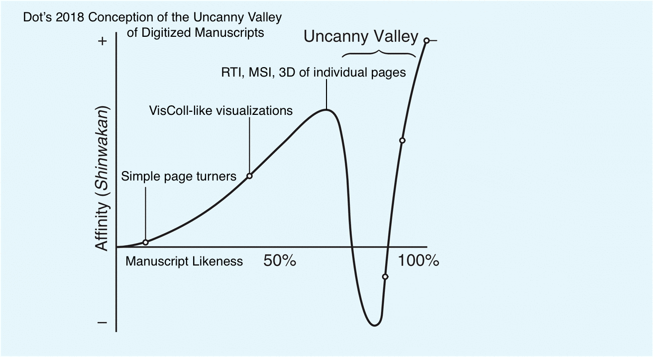
The uncanny valley was described by Masahiro Mori in a 1970 article in the Japanese journal Energy, and it wasn’t translated into English completely until 2012.[1] In this article, Mori discusses how he envisions people responding to robots as they become more like humans. The article is a thought piece – that is, it’s not based on any data or study. In the article, which we’ll walk through closely over the course of this presentation, Mori posits a graph, 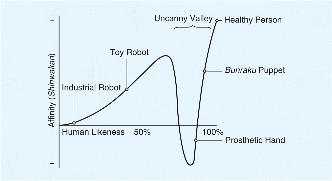 with human likeness on the x axis and affinity on the y axis. Mori’s proposition is that, as robots become more human-like, we have greater affinity for them, until they reach a point at which the likeness becomes creepy, or uncanny, leading to a sudden dip into negative affinity – the uncanny valley.
Now, Mori defined the uncanny valley specifically in relation to robotics, but I think it’s an interesting thought exercise to see how we can plot various presentations of digitized medieval manuscripts along the affinity/likeness axes, and think about where the uncanny valley might fall.
In 2009 I presented a paper, “Reading, Writing, Building: the Old English Illustrated Hexateuch,” (unpublished but archived in the Indiana University institutional repository) in which I considered the uncanny valley in relation to digital manuscript editions. This consideration followed a long description of the “Turning the Pages Virtualbook” technology which was then being developed at the British Library, of which I was quite critical. At that time, I said:
In my mind, the models created by Turning the Pages™ fall at the nadir of the “uncanny valley of digital texts” – which has perhaps a plain text transcription at one end and the original manuscript at the other end, with print facsimiles and editions, and the various digital displays and visualizations presented earlier in this paper falling somewhere between the plain text and the lip above the chasm.
Which would plot out something like this on the graph. (Graph was not included in the original 2009 paper)
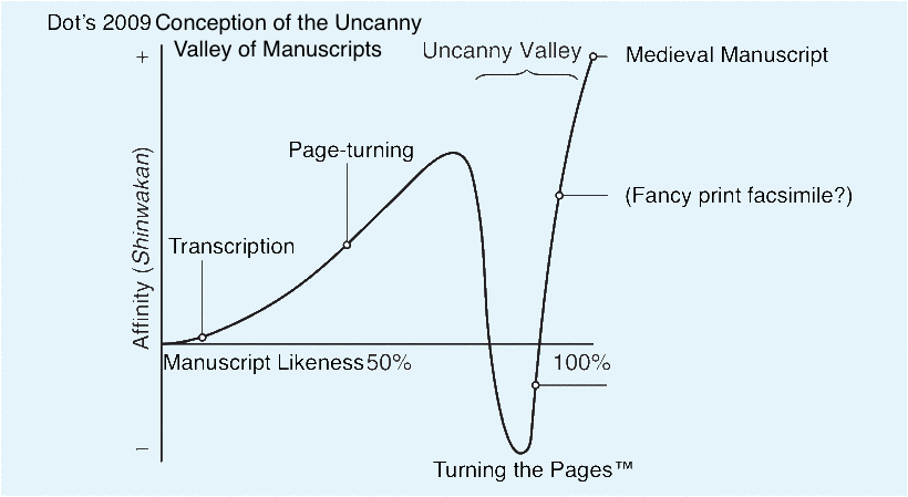
Nine years of thinking on this and learning more about how digital manuscripts are created and how they function, I’m no longer happy with this arrangement. Additionally, in 2009 I was working with imperfect knowledge of Mori’s proposition – the translation of the article I referred to then was an incomplete translation from 2005, and included a single, simplified graph in place of the two graphs from the original article – which we will look at later in this talk.
Manuscripts aren’t people, and digitized manuscripts aren’t robots, so before we start I want to be clear about what exactly I’m thinking about here. Out of Mori’s proposition I distill four points relevant to our manuscript discussion:
First, Robots are physical objects that resemble humans more or less (that is the x-axis of the graph)
Second, as robots become more human-like, people have greater affinity for them (until they don’t – uncanny valley) – this is the y-axis of the graph
Third, the peak of the graph is a human, not the most human robot
Fourth, the graph refers to robots and to humans generally, not robots compared to a specific human.
Four parallel points can be drawn to manuscripts:
First, digitized manuscripts are data about manuscripts (digital images + structural metadata + additional data) that are presented on computers. Digitized manuscripts are pieces, and in visualizing the manuscript on a computer we are reconstructing them in various ways. (Given the theme of the session I want to point out that this description makes digitized manuscripts sound a lot more like Frankenstein’s creature than like a traditional zombie, and I’m distraught that I don’t have time to investigate this concept further today) These presentations resemble the parent manuscript more or less (this is the x-axis)
Second, as presentations of digitized manuscripts become more manuscript-like, people have greater affinity for them (until they don’t – uncanny valley) – this is the y-axis
Third, the peak of the graph is the parent manuscript, not the most manuscript-like digital presentation
Fourth, the graph refers to a specific manuscript, not to manuscripts generally
I think that this is going to be the major difference in applying the concept of the uncanny valley to manuscripts vs. robots: while Robots are general, not specific (i.e., they are designed and built to imitate humans and not specific people), the ideal (i.e., most manuscript-like) digital presentation of a manuscript would need to be specific, not general (i.e., it would need to be designed to look and act like the parent manuscript, not like any old manuscript)
Now let’s move on to Affinity
A Valley in One’s Sense of Affinity
Mori’s article is divided into four sections, the first being “A Valley in One’s Sense of Affinity”. In this section Mori describes what he means by affinity and how affinity is affected by sensory input. Figure one in this section is the graph we saw before, which starts with an Industrial Robot (little likeness, little affinity), then a Toy Robot (more likeness, more affinity), then drops to negative affinity at about 80-85% likeness, with Prosthetic Hand at negative affinity and Bunraku Puppet on the steep rise to positive affinity and up to Healthy Person.
For Mori, sensory input beyond the visual is important for an object’s placement on the x-axis. An object might look very human, but if it feels strange, that doesn’t only send the affinity into the negative, but it also lessens the likeness. Mori’s original argument focuses on prosthetic hands, specifically about realistic prosthetic hands, which cannot be distinguished at a glance from real ones. I’m afraid the language in his example is abelist so I don’t want to quote him,

but his argument is essentially that a very realistic prosthetic hand, when one touches it and realizes it is not a real hand (as one had been led to believe), it becomes uncanny. Relating this feeling to the graph, Mori says, “In mathematical terms, this can be represented by a negative value. Therefore, in this case, the appearance of the prosthetic hand is quite humanlike, but the level of affinity is negative, thus placing the hand near the bottom of the valley in Figure 1.”

Bunraku puppets, while not actually resembling humans physically as strongly as a very realistic prosthetic hand visually resembles a human hand, fall farther up the graph both in terms of likeness and in affinity. Mori makes it clear that likeness is not only, or even mostly, a visual thing. He says:
I don’t think that, on close inspection, a bunraku puppet appears similar to a human being. Its realism in terms of size, skin texture, and so on, does not even reach that of a realistic prosthetic hand. But when we enjoy a puppet show in the theater, we are seated at a certain distance from the stage. The puppet’s absolute size is ignored, and its total appearance, including hand and eye movements, is close to that of a human being. So, given our tendency as an audience to become absorbed in this form of art, we might feel a high level of affinity for the puppet.
So it’s not that bunraku puppets look like humans in great detail, but when we experience them within the context of the puppet show they have the affect of being very human-like, thus they are high on the human likeness scale.
For a book-related parallel I want to quote briefly a blog post, brought to my attention earlier this week, by Sean Gilmore. Sean is an undergraduate student at Colby College and this past semester took Dr. Megan Cook’s Book History course, for which he wrote this post, “Zombie Books; Digital Facsimiles for the Dotty Dimple Stories.” There’s nothing in this post to suggest that Sean is familiar with the uncanny valley, but I was tickled with his description of reading a digital facsimile of a printed book. Sean says:
In regards to reading experience, reading a digital facsimile could not be farther from the experience of reading from the Dotty Dimple box set. The digital facsimile does in truth feel like reading a “zombie book”. While every page is exactly the same as the original copy in the libraries of the University of Minnesota, it feels as though the book has lost its character. When I selected my pet book from Special Collection half of the appeal of the Dotty Stories was the small red box they came in, the gold spines beckoning, almost as if they were shouting out to be read. This facsimile, on the other hand, feels like a taxidermy house cat; it used to be a real thing, but now it feels hollow, and honestly a little weird.
Sean has found the uncanny valley without even knowing it exists.
The Effect of Movement
The second section of Mori’s article, and where I think it really gets interesting for thinking about digitized manuscripts, is The Effect of Movement. In the first section we were talking in generalities, but here we see what happens when we consider movement alongside general appearance. Manuscripts, after all, are complex physical objects, much as humans are complex physical objects. Manuscripts have multiple leaves, which are connected to each other across quires, the quires which are then bound together and, often, connected to a binding. So moving a page doesn’t just move a page, much as bending your leg doesn’t just move your leg. Turning the leaf of a manuscript might tug on the conjoined leaf, push against the binding, tug on the leaves preceding and following – a single movement provoking a tiny chain reaction through the object, and one which, with practice, we are conditioned to recognize and expect.
Mori says:
Movement is fundamental to animals— including human beings—and thus to robots as well. Its presence changes the shape of the uncanny valley graph by amplifying the peaks and valleys 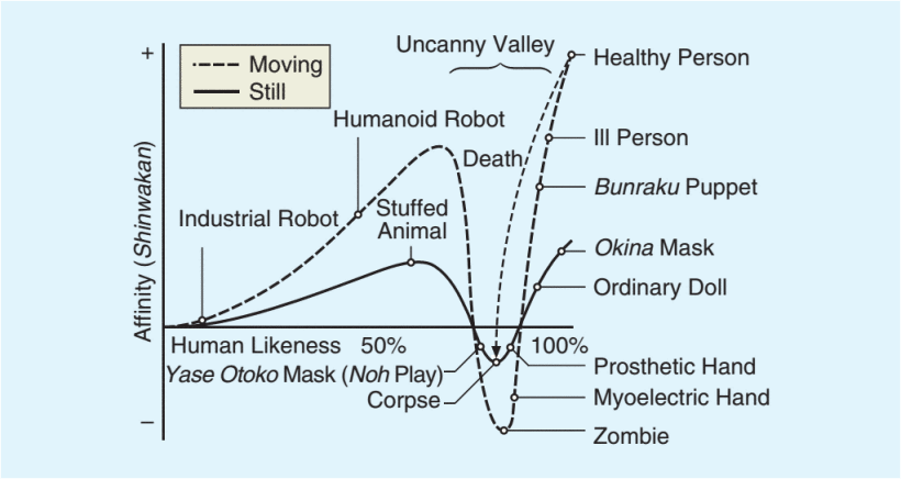 (Figure 2). For illustration, when an industrial robot is switched off, it is just a greasy machine. But once the robot is programmed to move its gripper like a human hand, we start to feel a certain level of affinity for it.
And here, finally, we find our zombie, at the nadir of the “Moving” line of the uncanny valley. The lowest point of the “Still” line is the Corpse, and you can see the arrow Mori has drawn from “Healthy Person” at the pinnacle of the graph down to “Corpse” at the bottom. As Mori says, “We might be glad that this arrow leads down into the still valley of the corpse and not the valley animated by the living dead.” A zombie is thus, in this proposition, an animated corpse. So what is a “dead” manuscript? What is the corpse? And what is the zombie? (I don’t actually have answers, but I think Johanna might be addressing these or similar questions in her talk)


I expect most of us here have seen zombie movies, so, in the same way we’ve been conditioned to recognize how manuscripts move, we’ve been conditioned to understand when we’re looking at “normal” humans and when we’re looking at zombies. They move differently from normal humans. It’s part of the fun of watching a zombie film – when that person comes around the corner, we (along with the human characters in the film) are watching carefully. [13] Are they shuffling or just limping? [14] Are they running towards us or away from something else? It’s the movement that gives away a zombie, and it’s the movement that will give away a zombie manuscript.
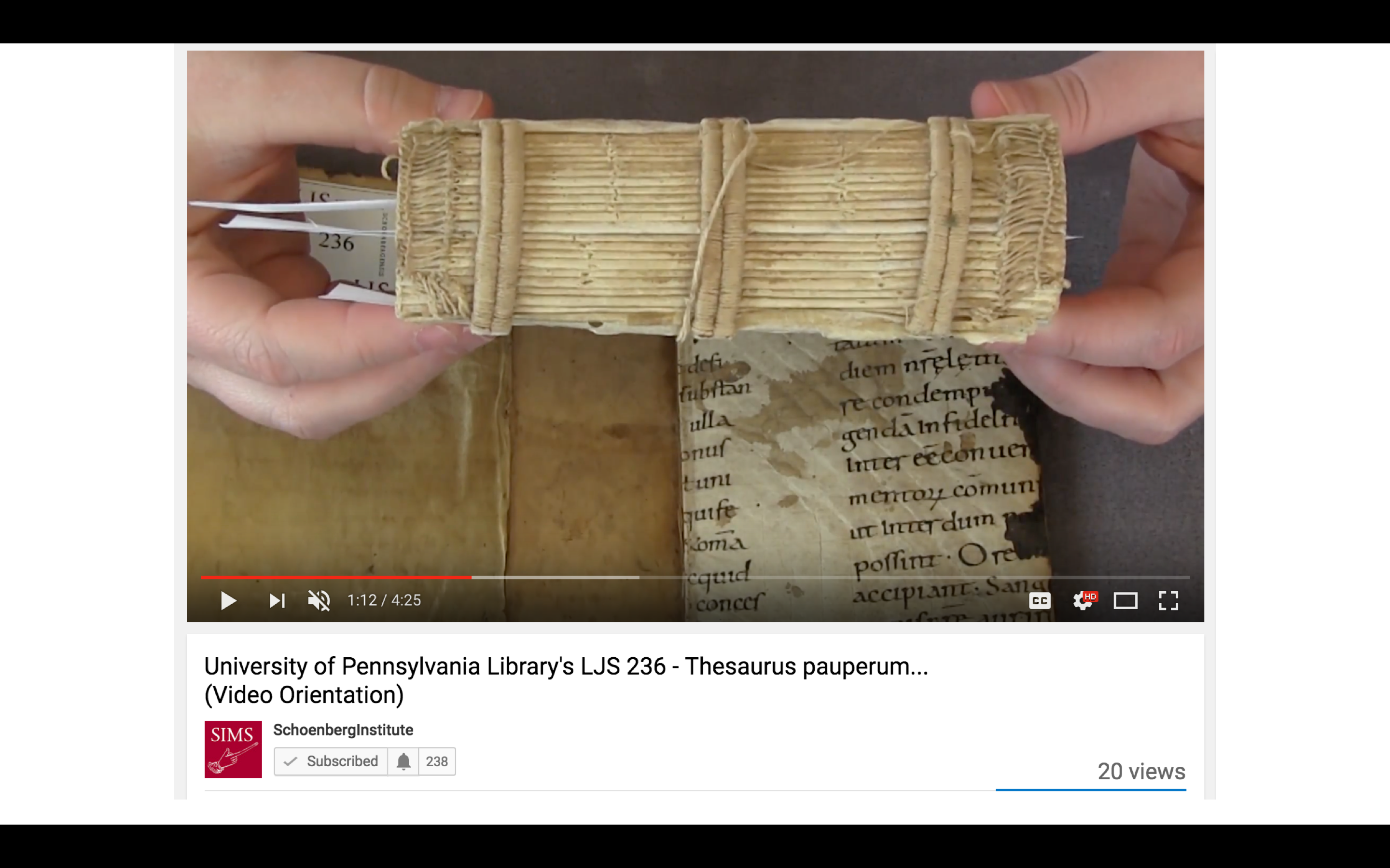
I want to take a minute to look at a manuscript in action. This is a video of me turning the pages of Ms. Codex 1056, a Book of Hours from the University of Pennsylvania. This will give you an idea of what this manuscript is like (its size, what its pages look like, how it moves, how it sounds), although within Mori’s conception this video is more similar to a bunraku puppet than it is like the manuscript itself.
It’s a copy of the manuscript, showing just a few pages, and the video was taken in a specific time and space with a specific person. If you came to our reading room and paged through this manuscript, it would not look and act the same for you.
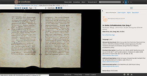
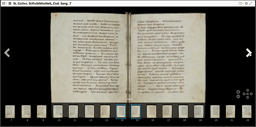
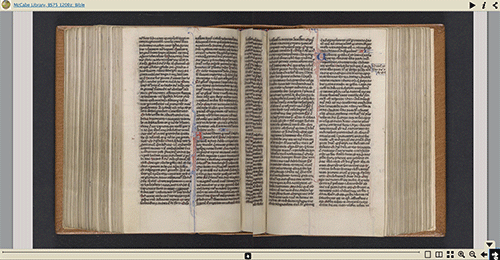
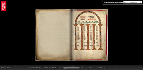 Now let’s take a look at a few examples of different page-turning interfaces. The first is from e-codices, and is their regular, purpose-built viewer. When you select the next page, the opening is simply replaced with the next opening (after a few seconds for loading). The second is also e-codices, but is from the Mirador viewer, a IIIF viewer that is being adopted by institutions and that can also be used by individuals. Similar to the other viewer, when you select the next page the opening is replaced with the next opening (and you can also track through the pages using the image strip along the bottom of the window). The next example is a Bible from Swarthmore College near Philadelphia, presented in the Internet Archive BookReader. This one is designed to mimic a physical page turning, but it simply tilts and moves the image. This would be fine (maybe a bit weird) if the image were text-only, but as the image includes the edges of the text-block and you can see a bit of the binding, the effect here is very odd. Finally, my old friend Turning the Pages (a newer version than the one I complained about in my 2009 paper), which works very hard to mimic the movement of a page turning, but doing so in a way that is unlike any manuscript I’ve ever seen.
Escape by Design
In the third section of his article, Mori proposes that designers focus their work in the area just before the uncanny valley, creating robots that have lower human likeness but maximum affinity (similar to how he discussed bunraku puppets in the section on affinity, although they are on the other side of the valley). He says:
In fact, I predict that it is possible to create a safe level of affinity by deliberately pursuing a nonhuman design. I ask designers to ponder this. To illustrate the principle, consider eyeglasses. Eyeglasses do not resemble real eyeballs, but one could say that their design has created a charming pair of new eyes. So we should follow the same principle in designing prosthetic hands. In doing so, instead of pitiful looking realistic hands, stylish ones would likely become fashionable.
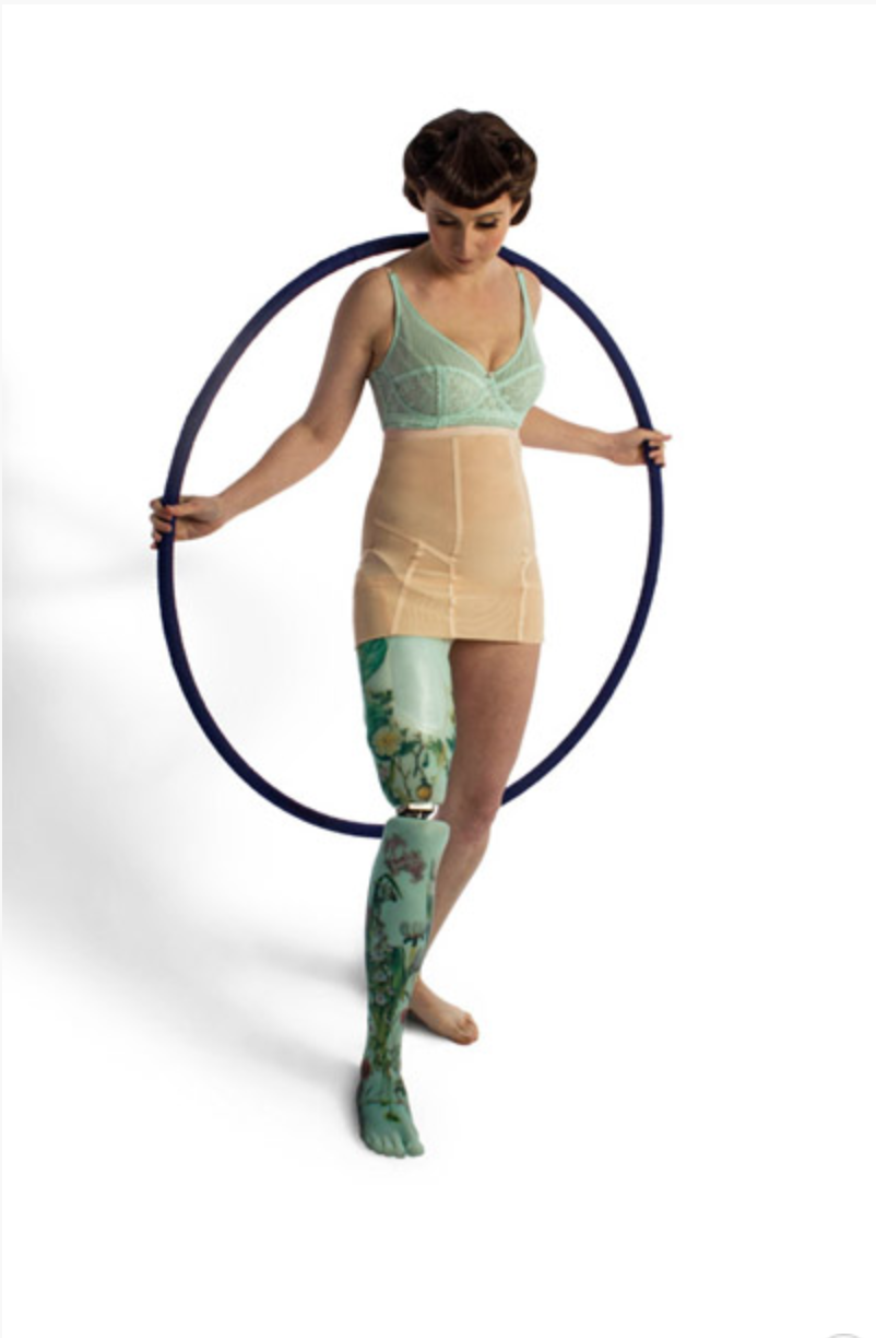
And here’s an example of a very stylish prosthetic leg from the Alternative Limb Project, which specializes in beautiful and decidedly not realistic prosthetic limbs (and realistic ones too). This is definitely a leg, and it’s definitely not her real leg.
In the world of manuscripts, there are a few approaches that would, I think, keep digitized manuscript presentations in that nice bump before the valley:
“Page turning” interfaces that don’t try to hard to look like they are actually turning pages (see the two e-codices examples above)
 Alternative interfaces that are obviously not attempting to show the whole manuscript but still illustrate something important about them (for example, RTI, MSI, or 3D models of single pages). This example is an interactive 3D image of the miniature of St. Luke from Bill Endres’s Manuscripts of Lichfield Cathedral project.
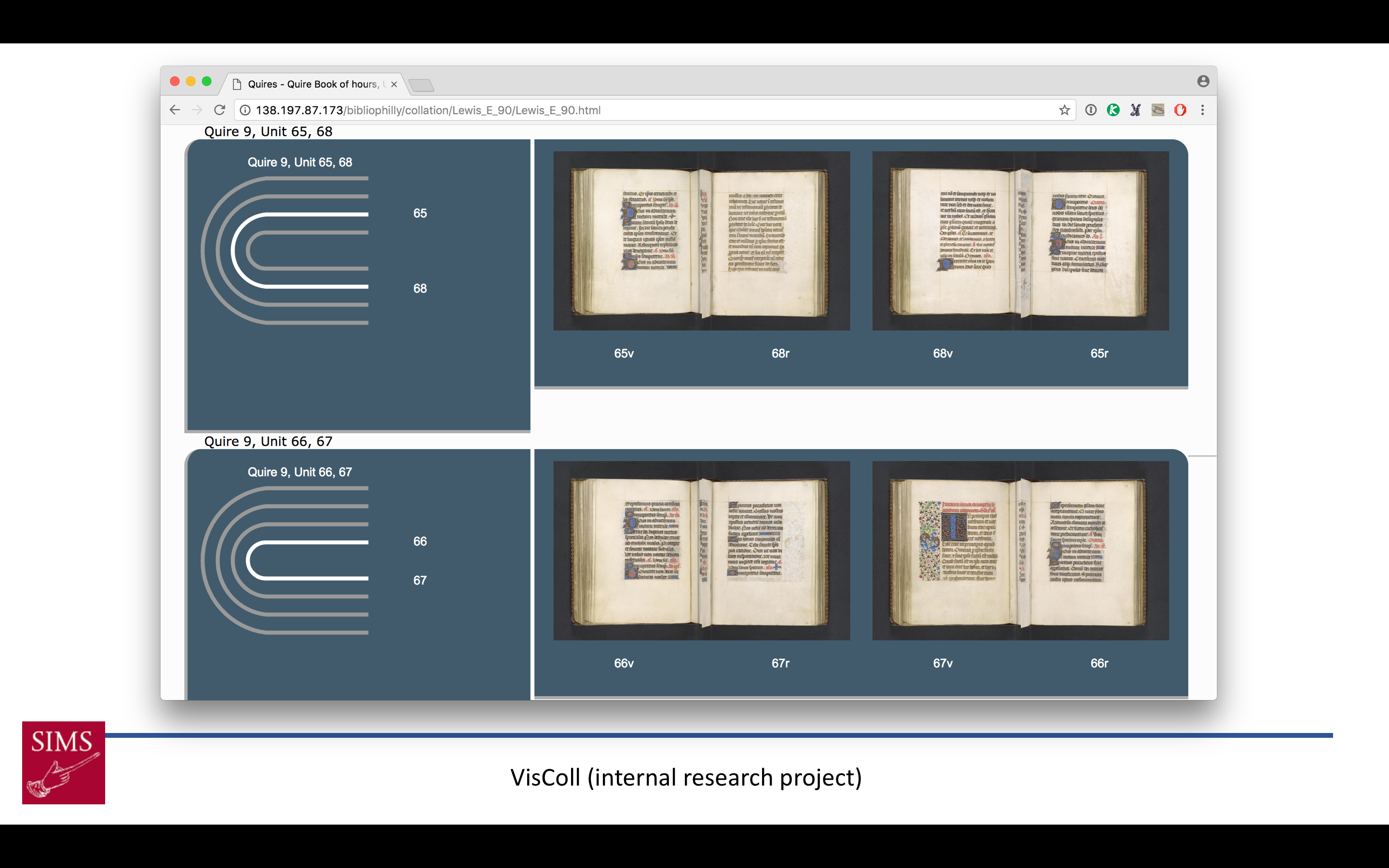
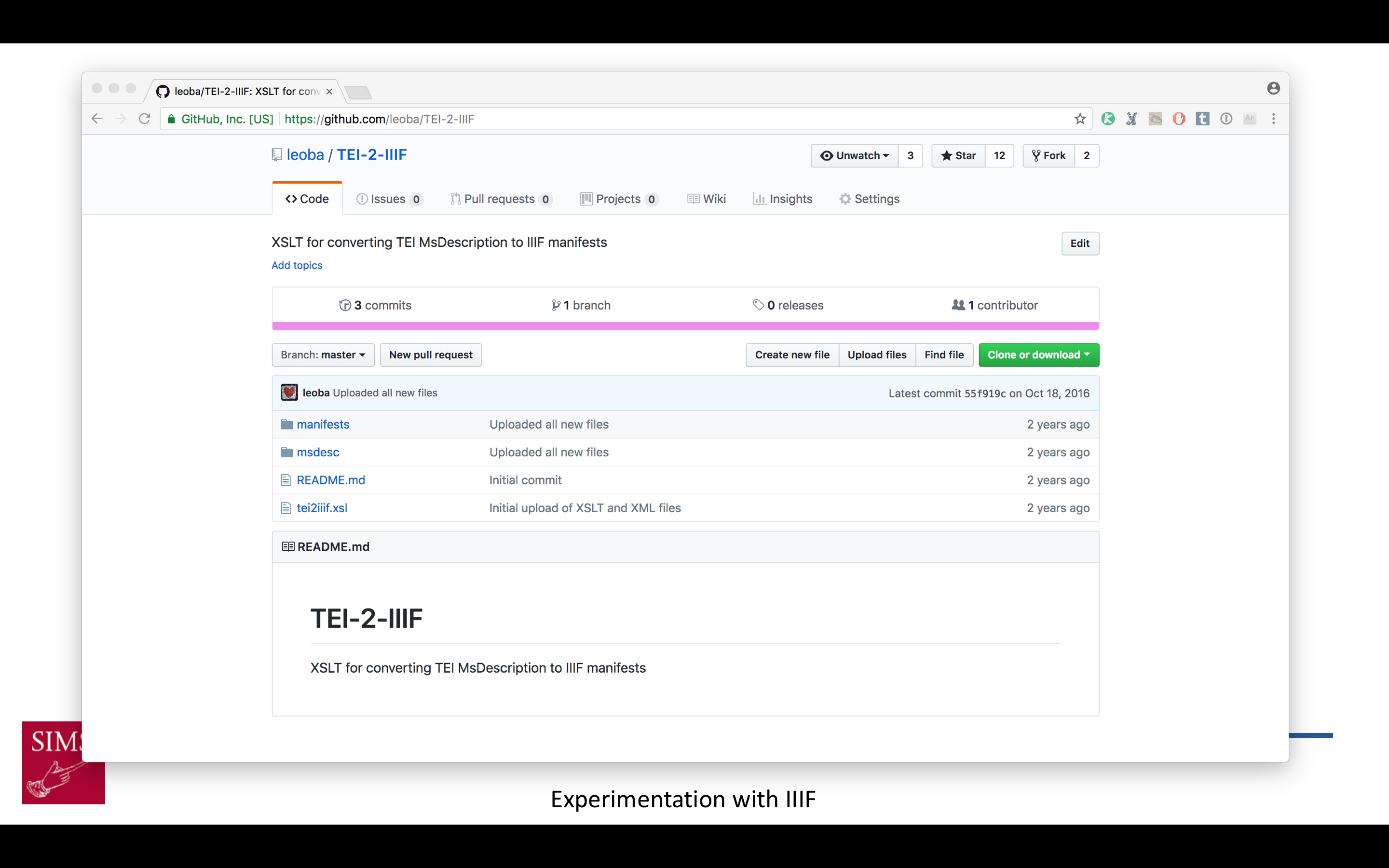
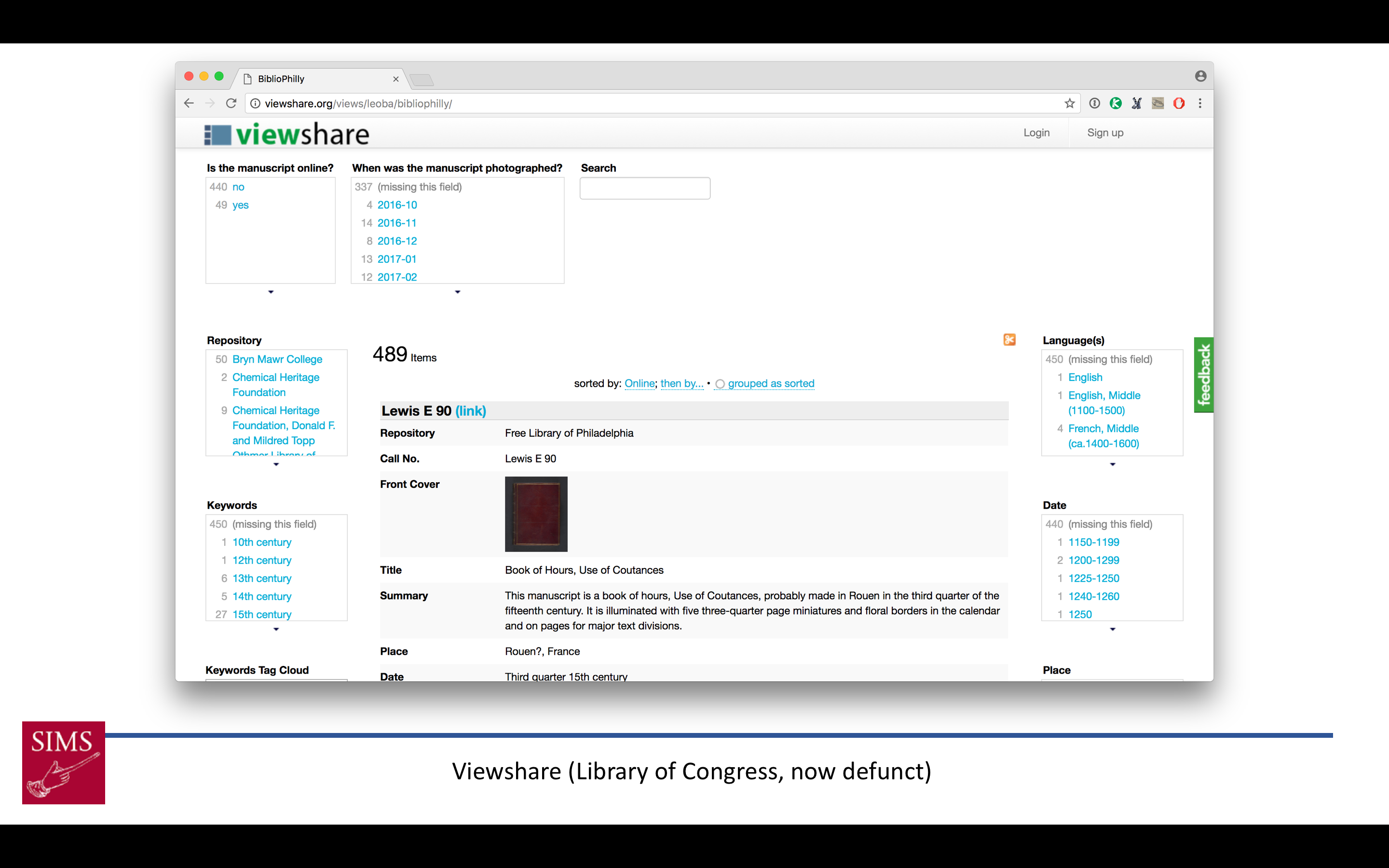
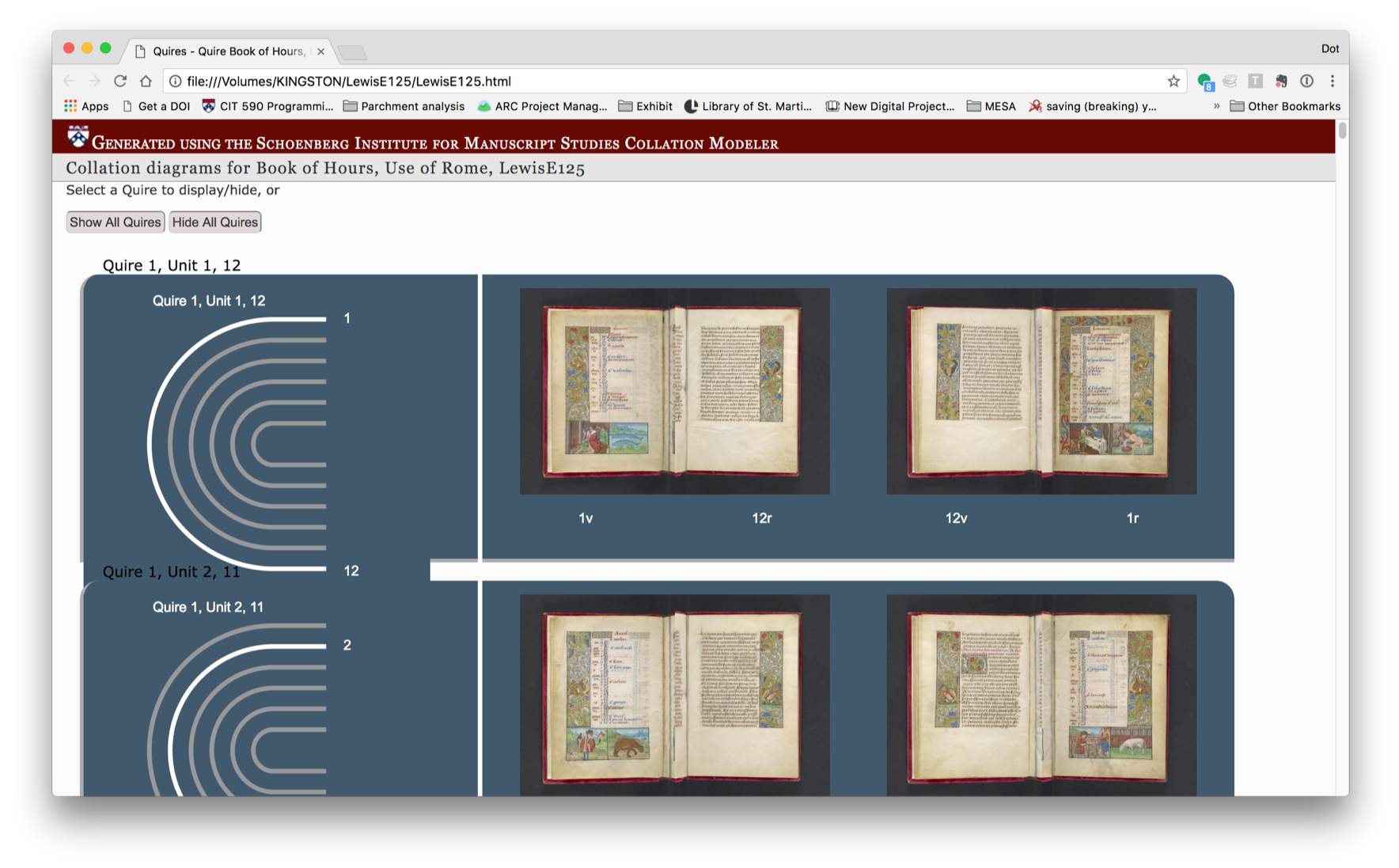 Visualizations that illustrate physical aspects of the manuscript without trying to imitate them (for example, VisColl visualizations with collation diagrams and bifolia)
I think these would plot out something like this on the graph.
This is all I have to say about the uncanny valley and zombie books, but I’m looking forward to Johanna, Bridget and Angie’s contributions and to our discussion at the end. I also want to give a huge shout-out to Johanna and Bridget, to Johanna for conceiving of this session and inviting me to contribute, and both of them for being immensely supportive colleagues and friends as I worked through my thoughts about frankenbooks and zombie manuscripts, many of which, sadly, didn’t make it into the presentation, but which I look forward to investigating in future papers.
[1] M. Mori, “The uncanny valley,” Energy, vol. 7, no. 4, pp. 33–35, 1970 (in Japanese); M. Mori, K. F. MacDorman and N. Kageki, “The Uncanny Valley [From the Field],” in IEEE Robotics & Automation Magazine, vol. 19, no. 2, pp. 98-100, June 2012. (translated into English) (https://ieeexplore.ieee.org/document/6213238/)